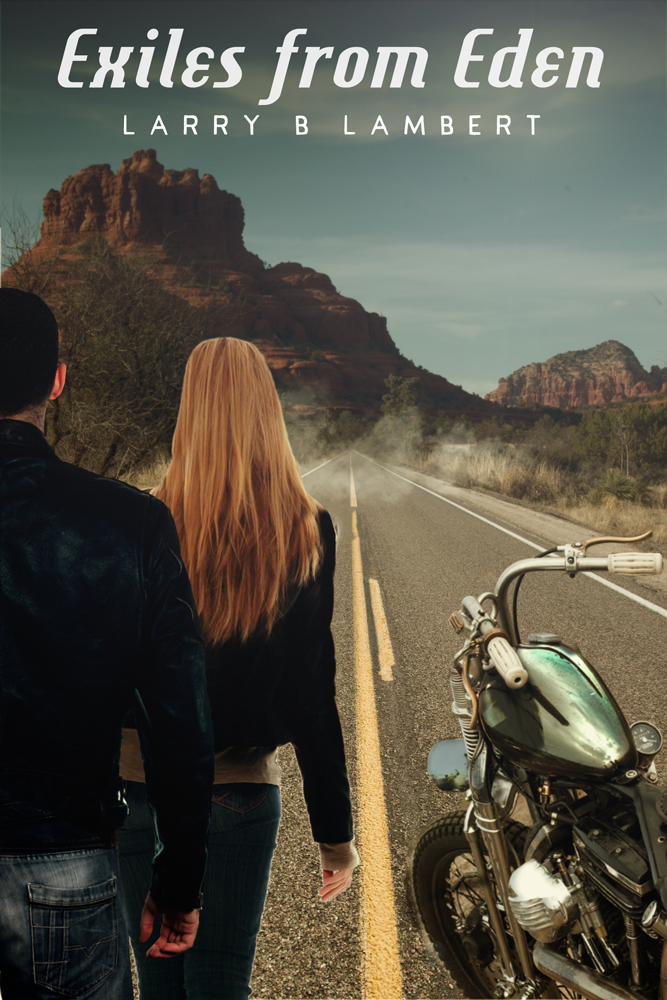
Book cover
Last year I was given the opportunity to make an album cover (currently scheduled for release in May, so i'll post a copy of it when it's out). This year I wanted to make a book cover and with thanks to Jules for the opportunity to do just that i'm pleased to say it's all complete. A copy is on the author's site so i'm sure it's okay to discuss it now.
The plan was to have an American California Highway with a Harley, and a male/blonde female couple.
Looking through my Lightroom catalogue for photos I could use on the back plate I found a wide-angle road i'd taken around the Mojave National Park, and a photo of the red rocks in Sedona. I stretched out the yellow dividing lines into the distance, darkened the clouds a little and merged them together into a single shot.
The next stop was to find a photo of a Harley, which I didn't have. I contacted someone from the next town who agreed to meet me one morning and I took about thirty shots of his bike hoping to hit on the right-angle to composite in.
The bike was, as you'd expect, quite shiny and so I had to make sure there were reflections of the appropriate things (sky, people) to seat it firmly in place. Also, I had to stretch and cajole the image slightly to try and best match the perspective.
It took a while to find the right people to go in the shot and in the end we bought a couple of images from Shutterstock.
The people has been shot in a studio and were lit by a light either side and so had a ring of light on both sides of their bodies. I removed this as the original back plate photo has been taken with quite a uniform light. The man's jacket was also a too light so I darkened that.
To tie it all together I colour-graded the image which always makes it look a lot more cohesive. I added some text with a font I bought (and also a free one via fontsquirrel.com and job done).
Which all makes it sound like a lot less work than it was, but forty+ layers of goodness and i'd say it looks okay.
The back cover was another photo from the Sedona series and gives a nice clear place for the blurb.


