Movie Posters
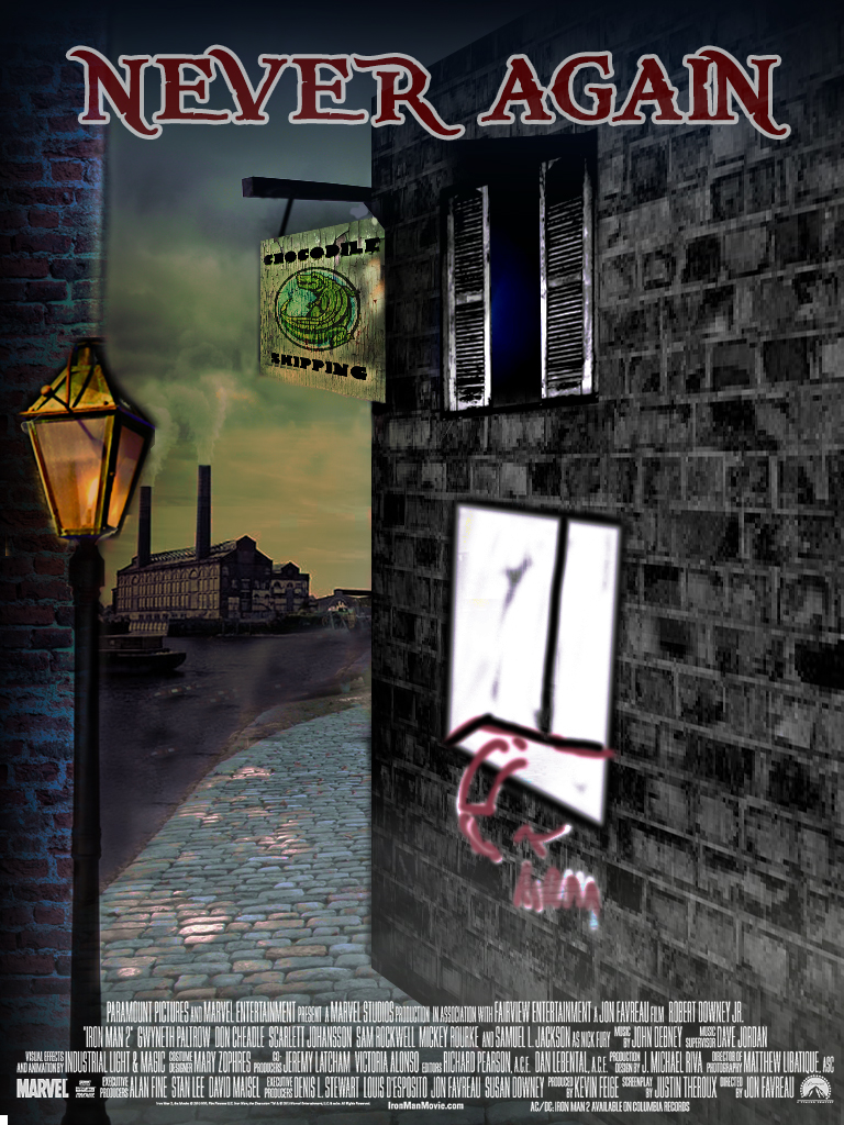
I was amusing myself by mocking up a movie poster which I may try and realise fully next year. A friend was trying to write a script about a grown up version of Peter Pan and I figured i'd try and use that as an idea for something photography related. I started off with a sketch of how I imagined the poster to be.
I then looked around for existing, temporary images to construct a composite image to clarify the design I could see in my head which got me (as I type) as far as this (with the final window, with an arm falling off the ledge - and the main character learning against the wharf with his back to the camera to go). The poster comprises of thirty-five layers in Photoshop.
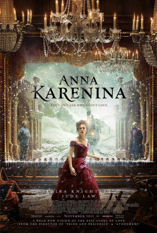
With movie posters in my head I was looking at one for Anna Karenina and it's a mixture of great photography and beautiful design. It was designed by a company called The Creative Partnership based in London, and you see more their work over on their website.


